Shipping, taxes, and discounts calculated at checkout.
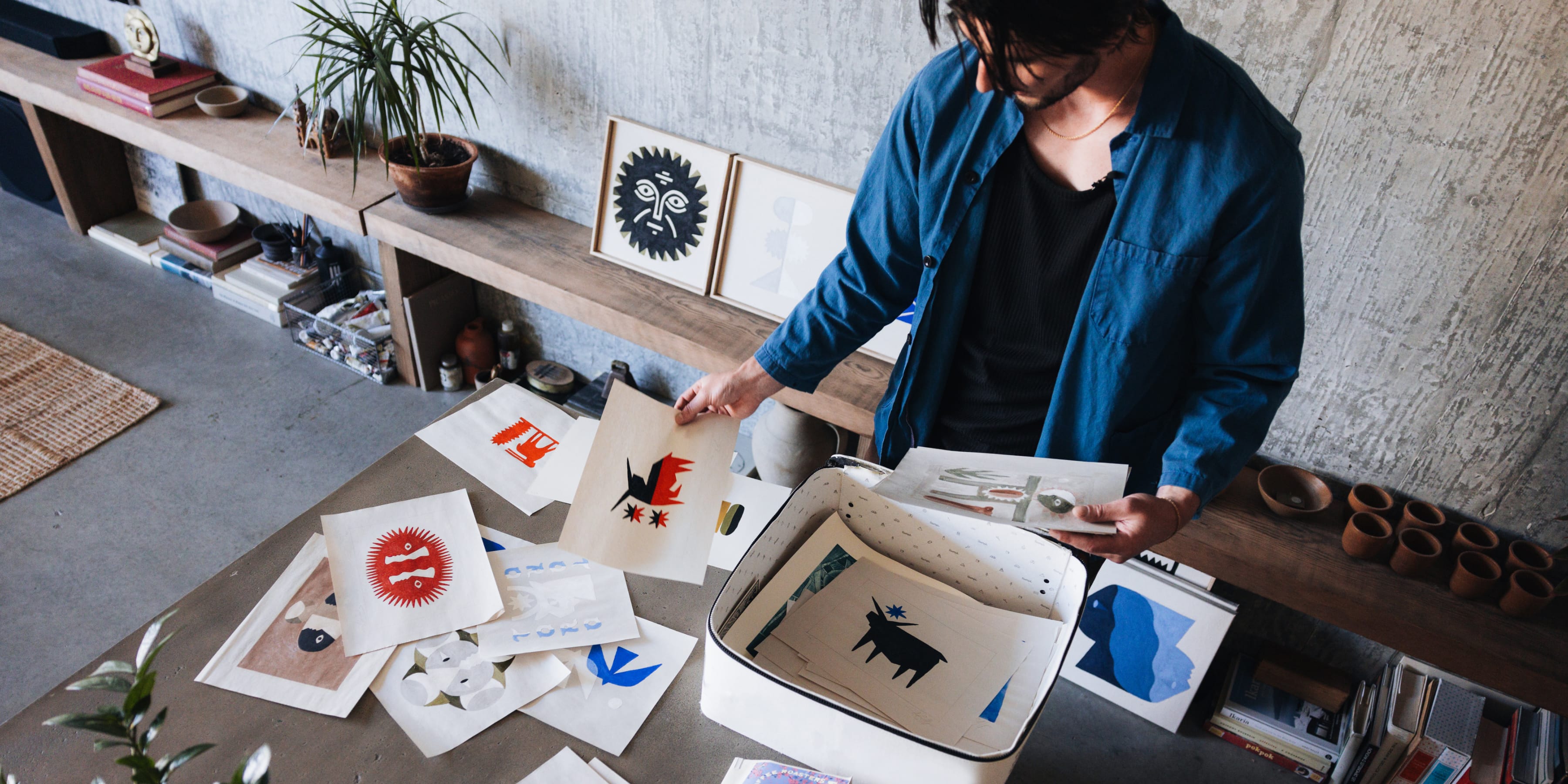
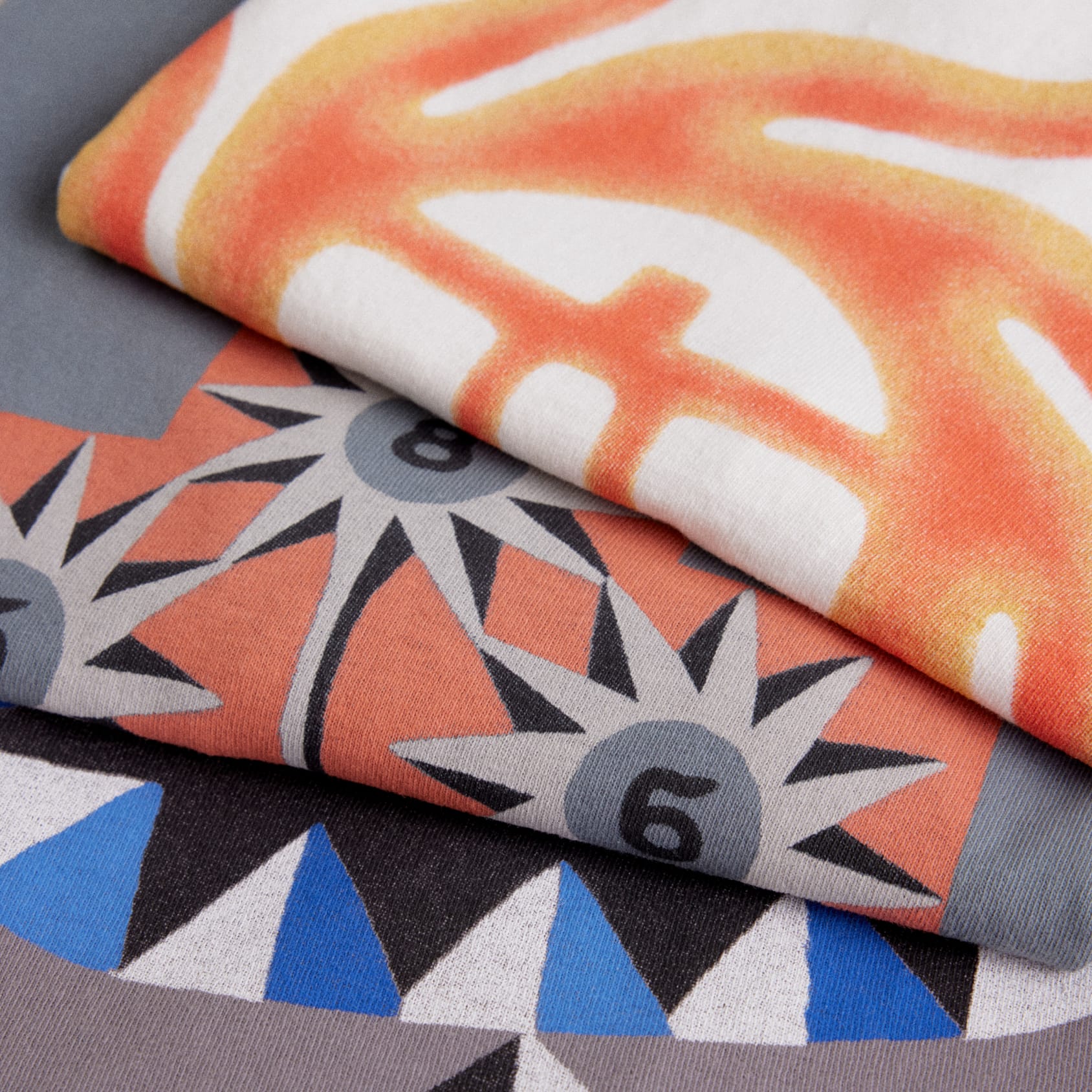
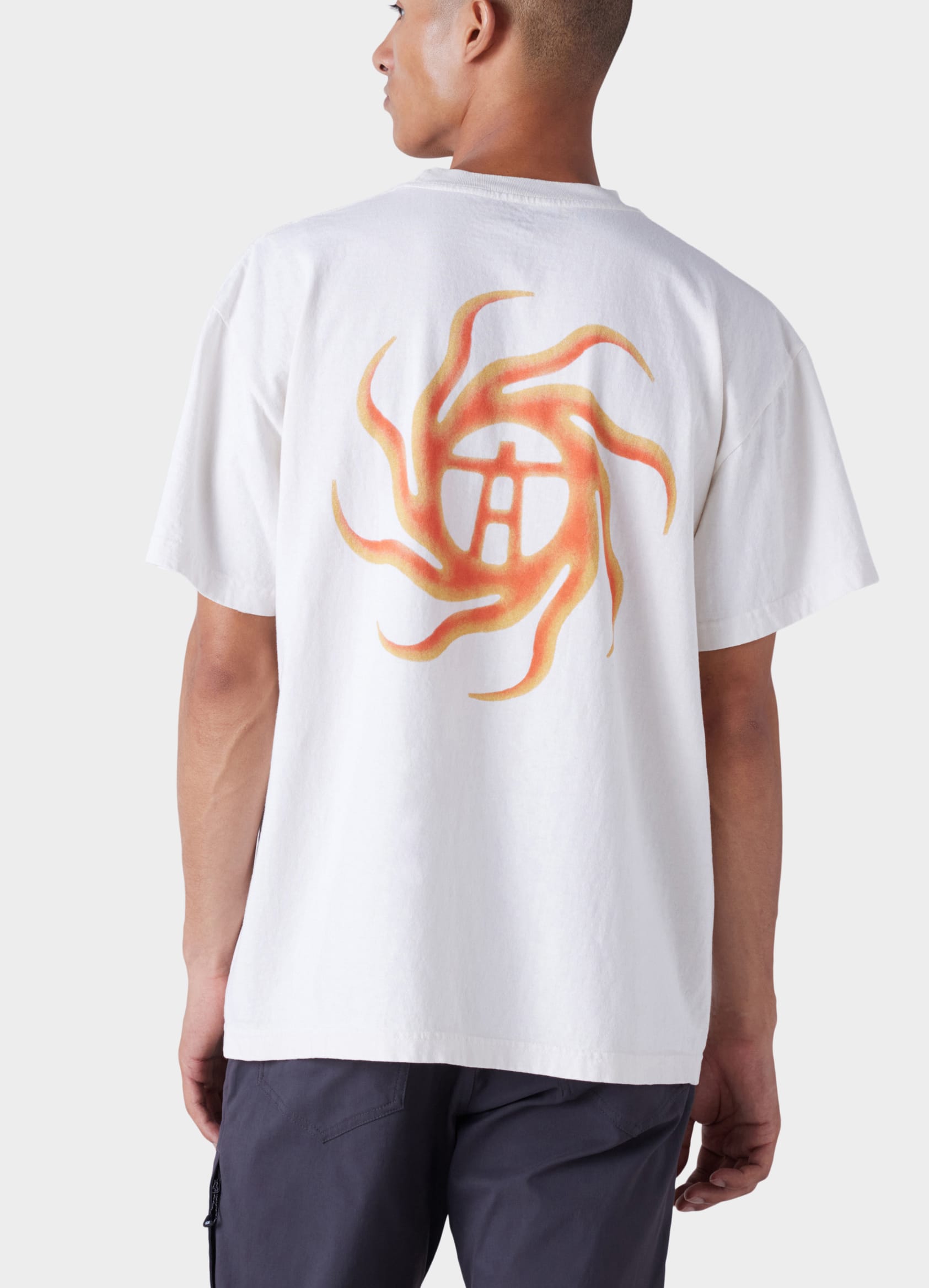
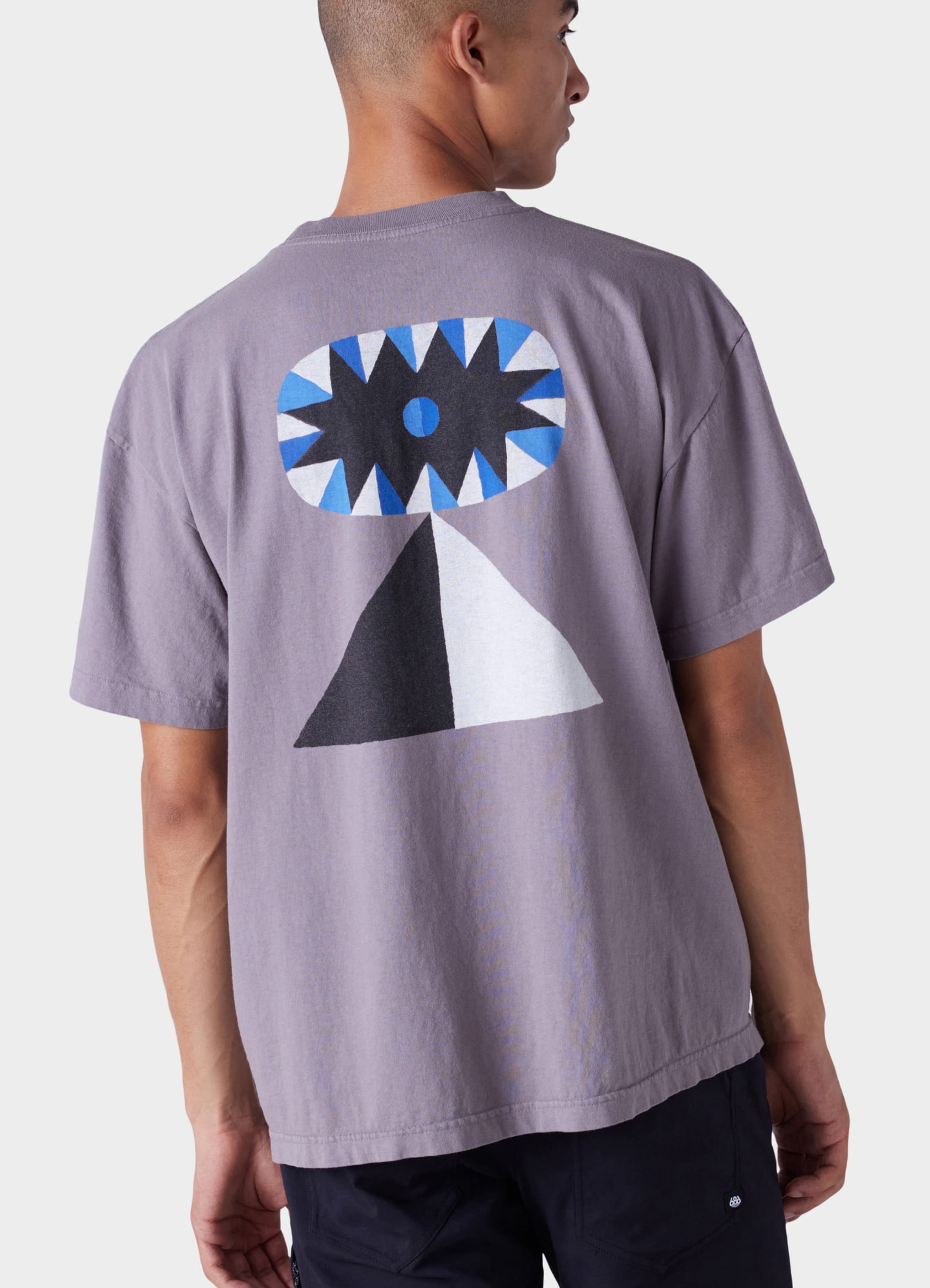
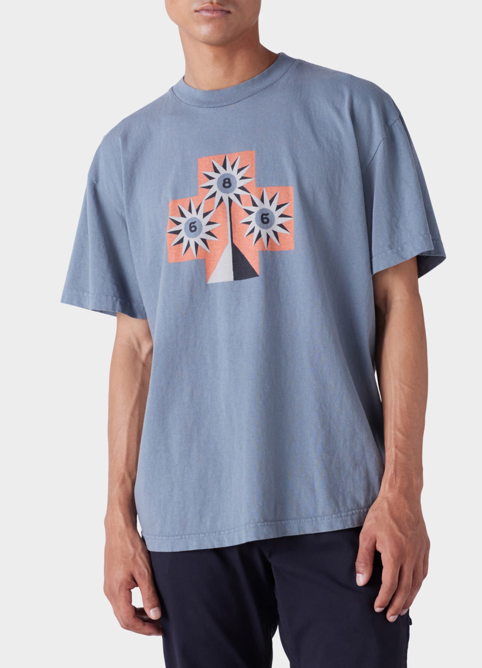
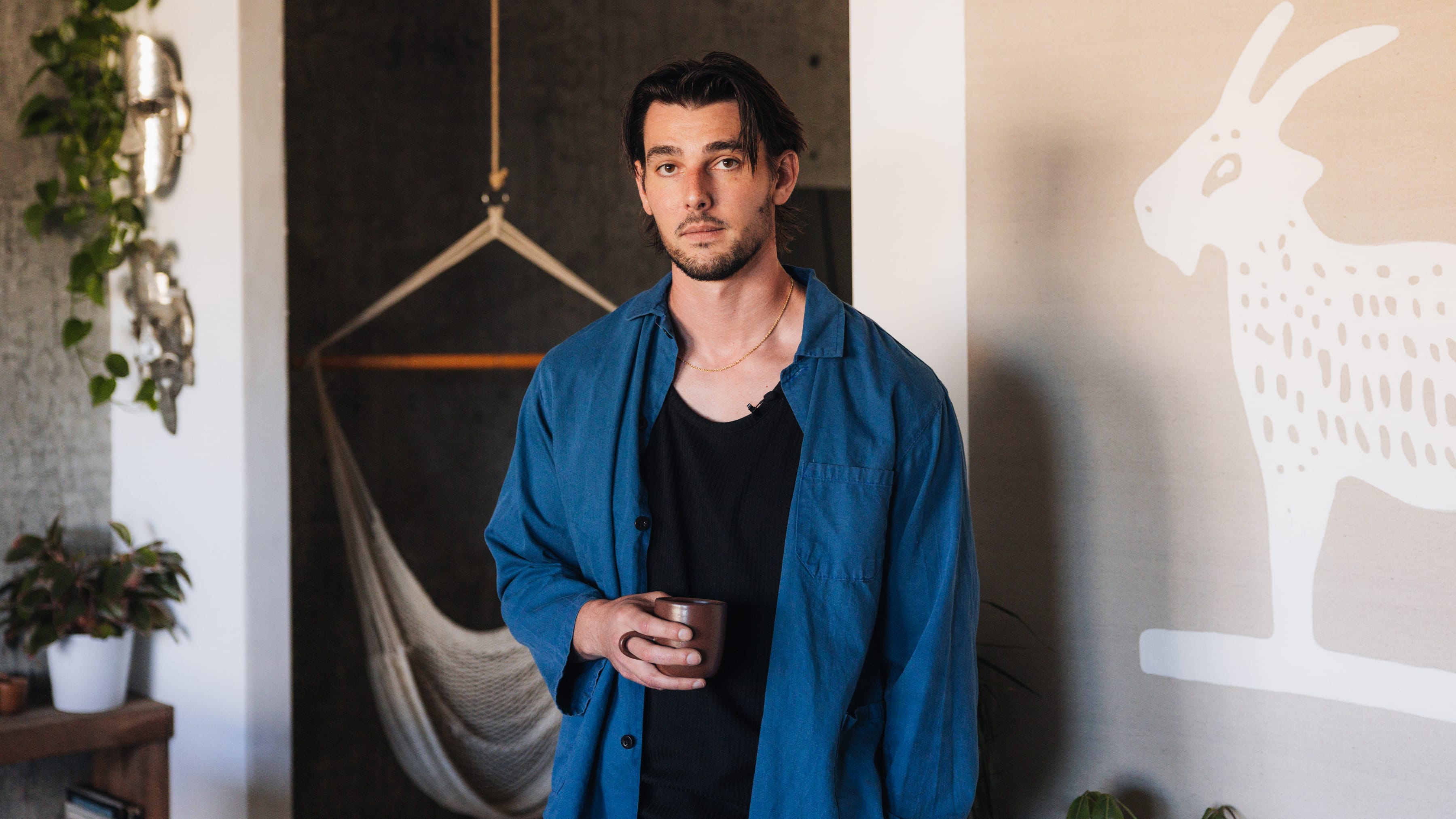
Create cool stuff with cool people. This is a mantra shared between 686 and James Coffman, so it was only natural that both parties would join forces on a collaboration. Whereas James comes from a professional baseball upbringing, and we evolved from snow sports, there is a shared common vision. Design is important. In art, athletics, and everyday life. Strip out the unnecessary and pull focus on what really matters. We sat down with James in his Portland studio to discuss being set adrift post-sports, the creative struggle, fonts, remaining elusive on social media, and more…
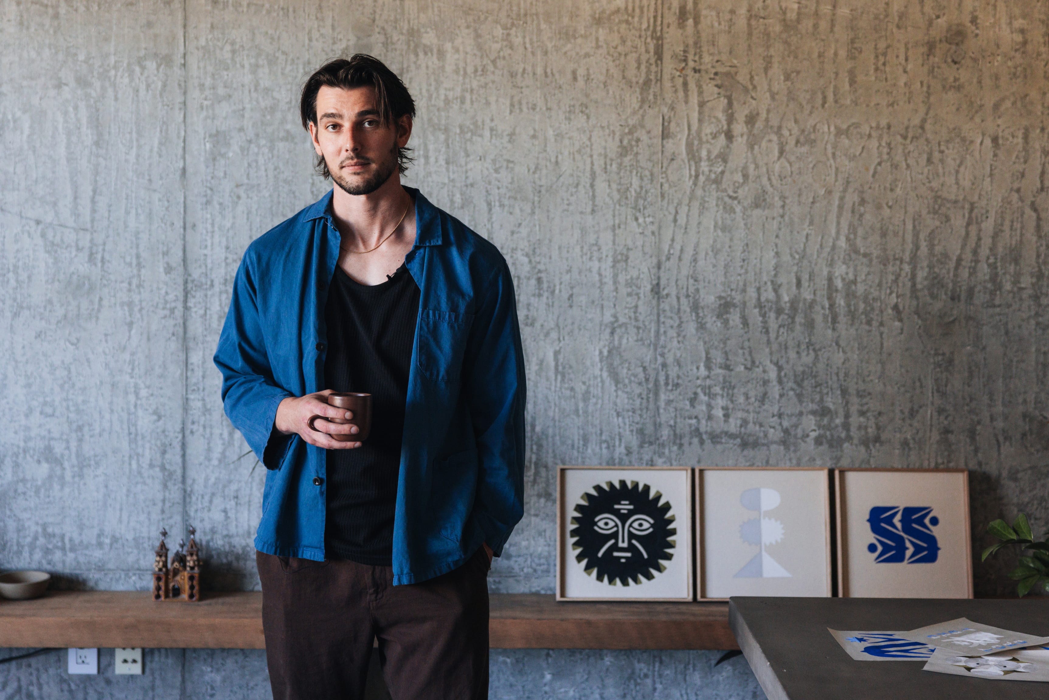
In your own words can you give us a brief introduction to who James Coffman is?
I’m a 30-year-old artist/designer living in Portland Oregon. My route to becoming that has been a bit unconventional. For most of my life the sole direction was towards baseball. My family, particularly my dad's side, is filled with All-Americans and professional athletes, so playing at that level wasn't a dream as much as it was something to be expected. I played through college and spent a few years in the minors with the Arizona Diamondbacks. When it ended, I was more or less set adrift, being in my mid 20's with no degree and no real-world job experience, but more importantly a personality that was formed around being an athlete. While my dad’s side of the family was marked with athletes and salt of the earth blue collar workers, my mom came from a family that celebrated the arts and a sense of refinement. Art supplies were never in short supply, so post-baseball I began painting, had a few small shows, sold a few pieces, but felt the need for something "practical." Growing up in Portland, and Nike being the imposing presence on the region that it is, working for them seemed like the logical pairing of my athletic background and interests in the arts. I wasn’t entirely sure what a designer did, but I knew Nike hired them. I signed up for classes at Portland State, quickly realizing I had a knack for design and aesthetics. Two years in I had started to take on small side projects, it began to feel like I was learning more from those than I was from the actual courses. So, I left, thinking I could always go back and finish if I fell on my face in the real world. That was four years ago, and it's largely worked out.
“Create cool stuff with cool people.” I read this quote on your website and it’s a value shared with 686. Can you elaborate on it and how it aligns with your work and who you choose to partner with?
I love art solely for itself, but design brings something exciting that art lacks. The ability to build something greater than yourself that's going to grow and live an entirely new life once it's left your hands. When you find a partner (like you guys) who share a vision, but still bring in new perspectives and ideas, it elevates the whole project. Working with others can be an exponential force, it can also be a destructive one when the wrong people come together. I'm always very selective about who I work with, because through past experiences I've seen both ends of that spectrum.
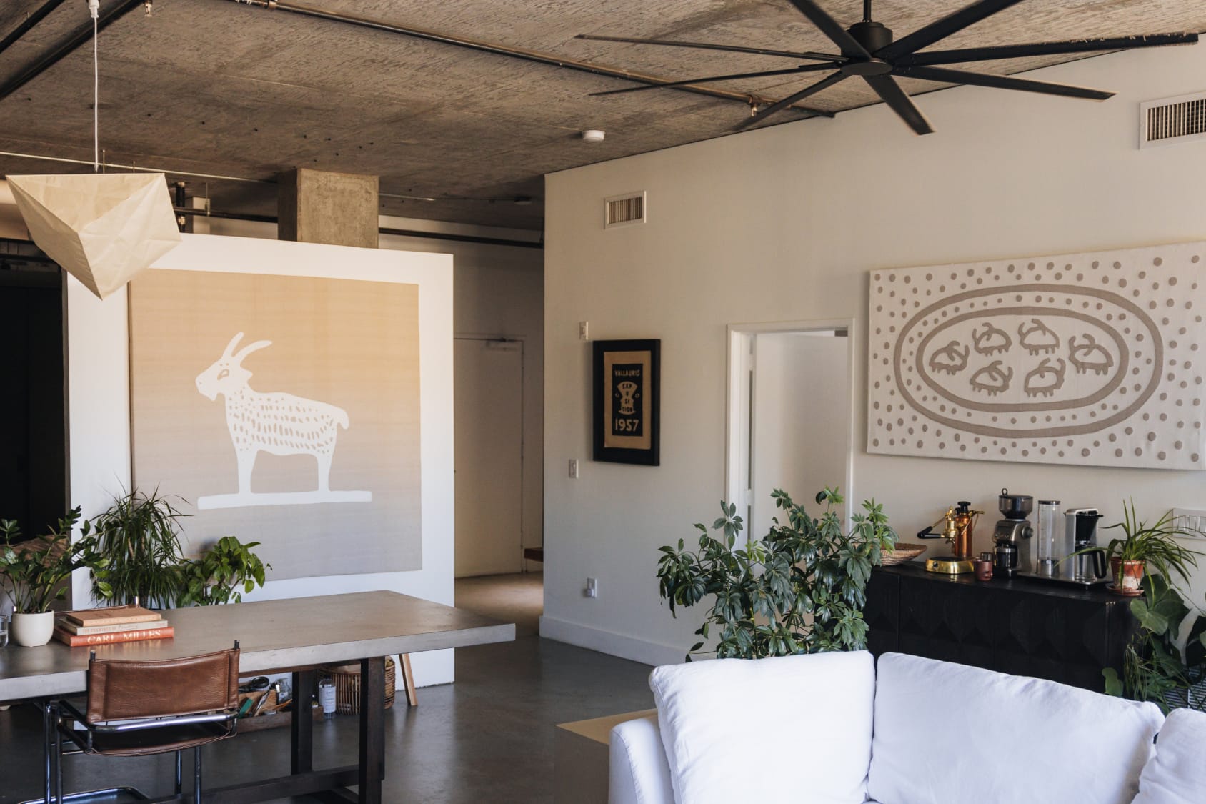
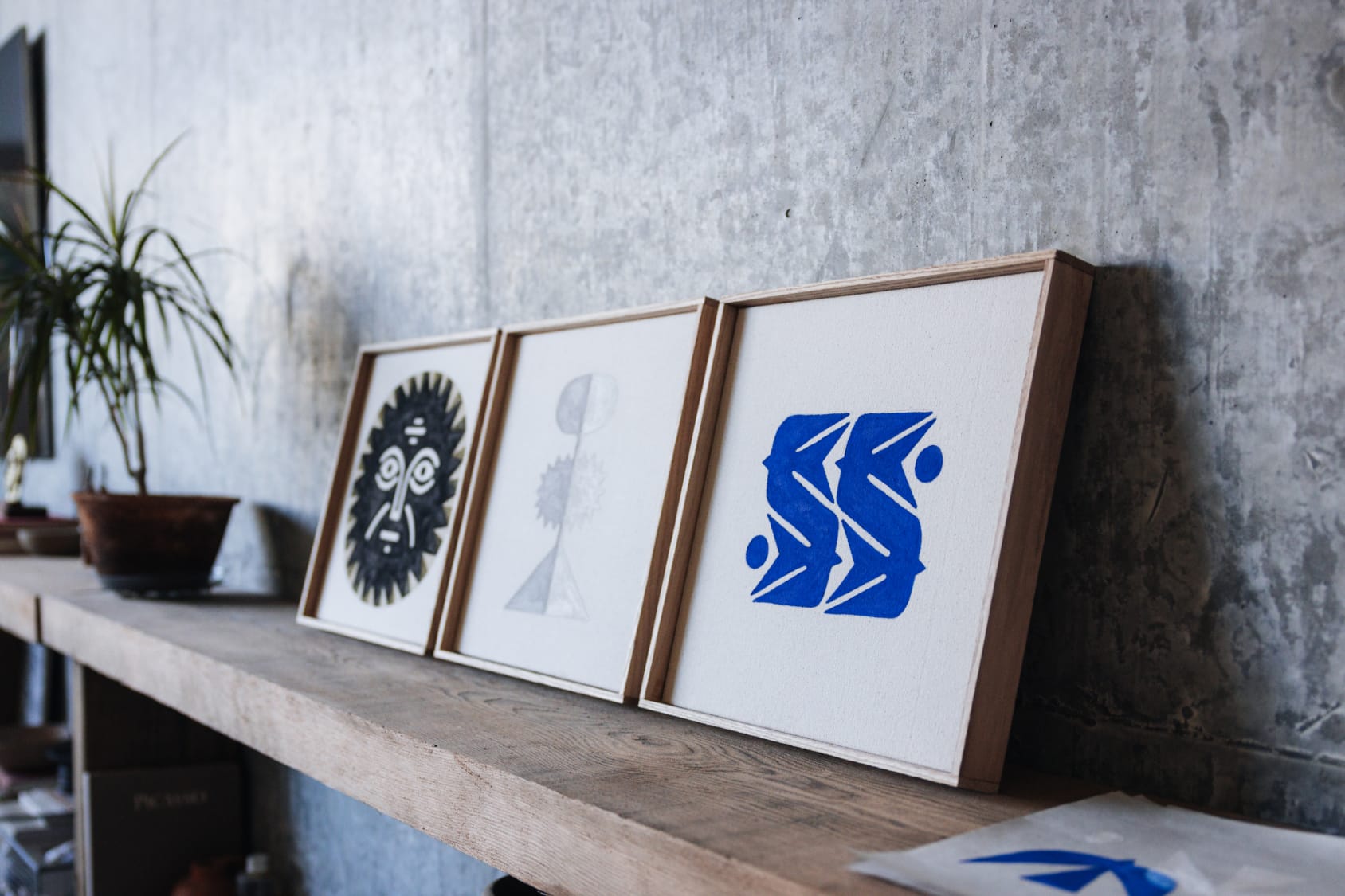
Portland is a creative hub. What do you find in the area that inspires you? Does it feel like home?
Portland’s home. I've traveled and lived in a handful of different places, but always find myself back here. There really is a genuine weirdness about the city. It leads to a sense of openness where people find it easier to move and experiment without judgment. The really odd folks almost provide a buffer for more "normal" people to push their limits. My temperament is probably better suited for New York or LA, but there's just something inescapable about this place in the best way.
At some point all artists struggle with inspiration/the blank page. You discussed this in your written piece that tackles, “The burden of creativity.” Is there anything you’ve learned in the years since you wrote about it?
Looking back that piece might have been a bit gloomy, but I think there is some truth to it. Creative people need to create, or they wither on the vine. The struggle with creativity is that it's not a blue-collar job where when the days over you stick the shovel in the hole and pick up where you started the next day. X amount of work rarely leads to X amount of output. Ideas are fleeting, all you can do is put yourself in the best position to allow the ideas to find you. I've always loved the Picasso quote "Inspiration exists but it has to find you working." I say creativity can be a burden, because if you find yourself in a position where your livelihood depends on it, every project is a bit of a gamble. Sometimes the idea appears in minutes, sometimes it takes weeks, sometimes it never comes at all. It can be mentally taxing as deadlines appear on the horizon and ideas are nowhere to be found. The difference in a creative person and a creative professional is that the former stands in a field and hopes creativity strikes, the latter climbs to the tallest tree and makes sure when it does strike, it won't be wasted.
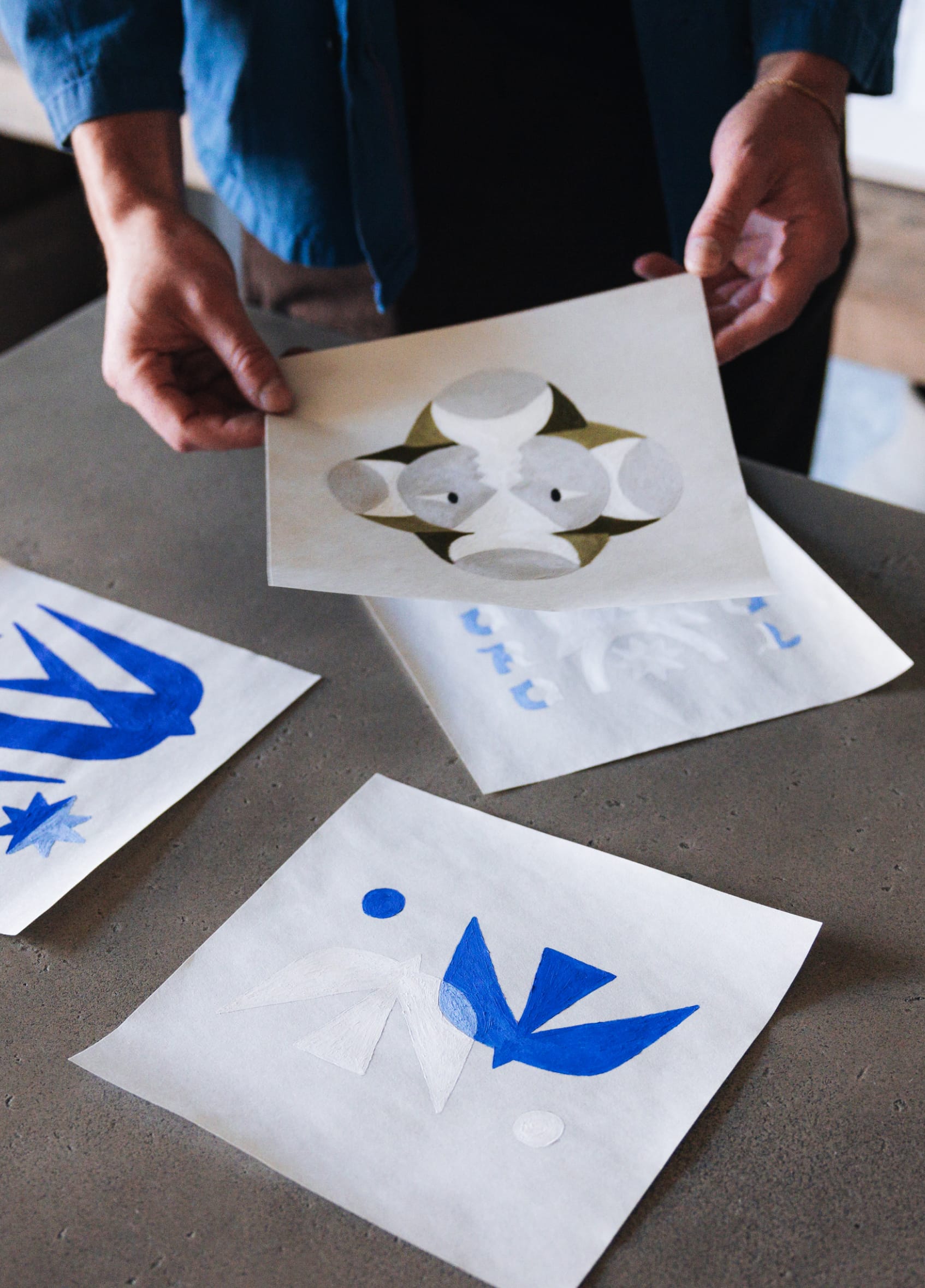
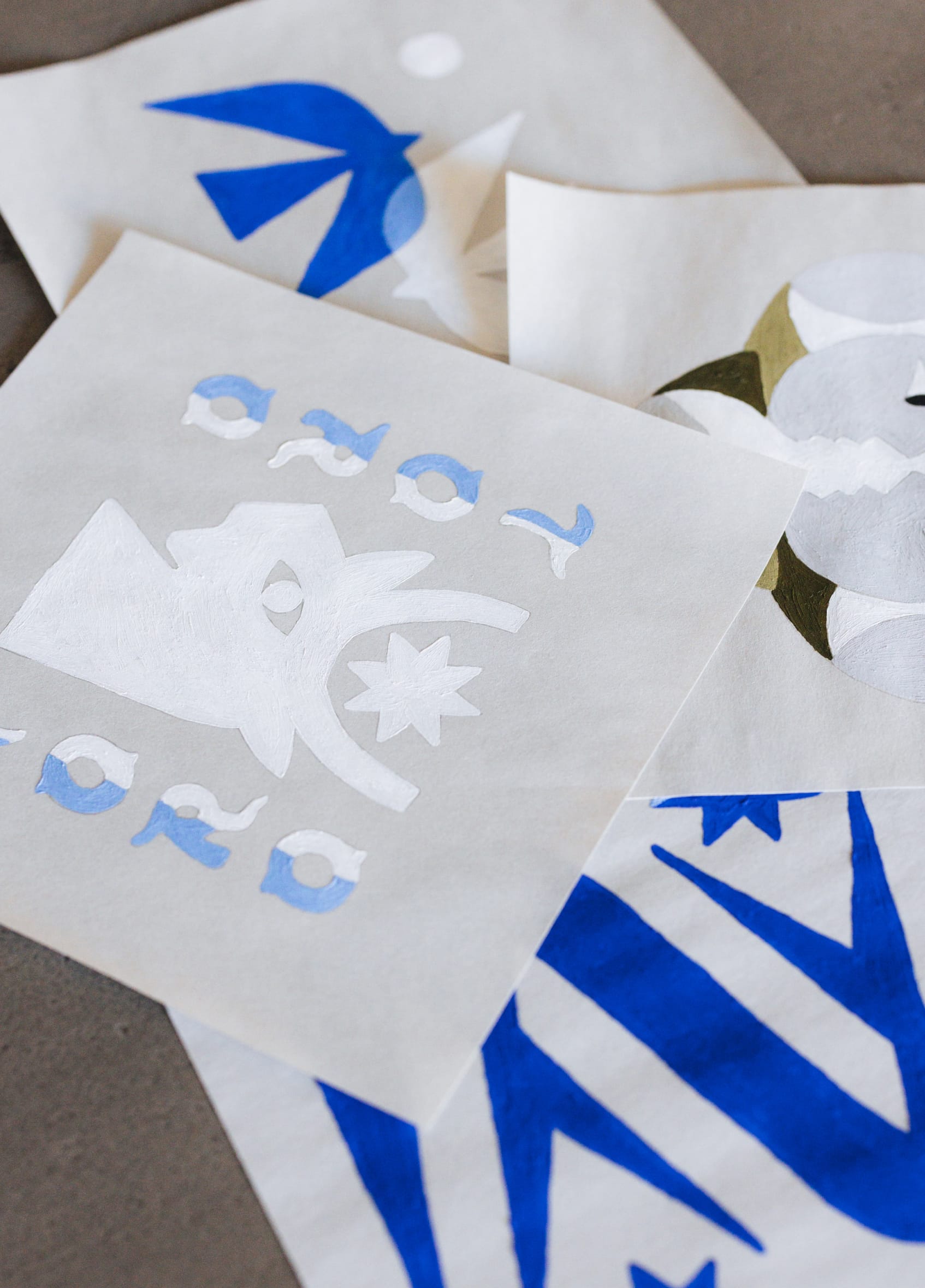
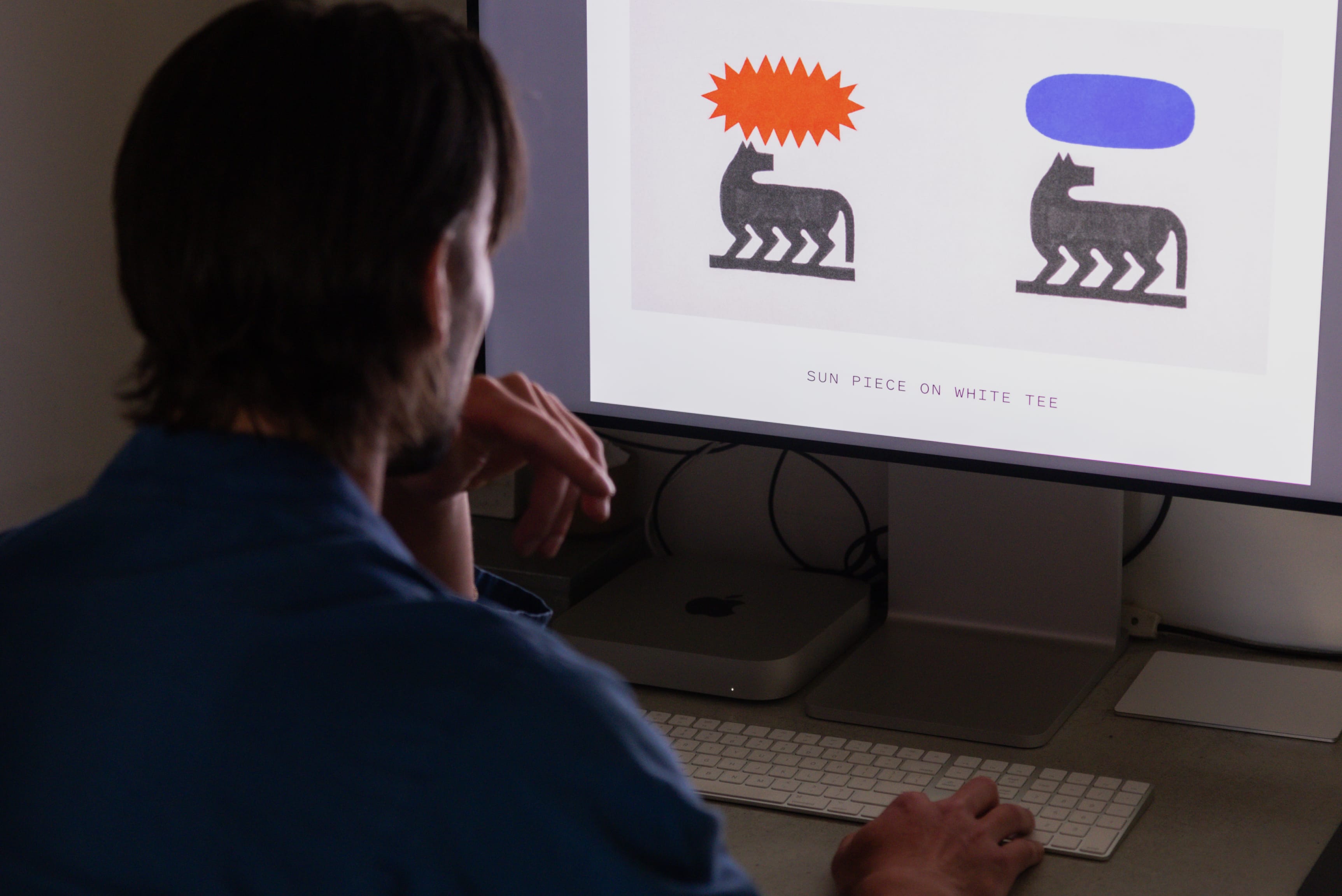
You’re prolific in your creation of fonts. This is just my take, but it seems like the general public isn’t actively aware of the importance of fonts. Once you do a deep dive though it opens a new world and it’s no longer possible to escape the effect that fonts have on your day-to-day life and emotions. Everything from road signs to business signs to restaurant menus, are not only giving us words but subtlety brainwashing us through design. What are your thoughts on fonts and what would you tell the average person (with no current interest) about them?
It’s been really interesting to see how the fonts have taken off. I see them almost daily walking down the street. I was watching the NBA playoffs a while back and during a commercial there they were on a Topo Chico ad, split second later it cuts to LeBron’s face. I had made that font while still in school for some class project and would never have imagined how far it would end up reaching. Fonts really are a pandoras box, once you start noticing them, that’s all you're going to see. You’ll recognize them, judge them, go "they should have used this one instead." To the uninitiated I'd say think about fonts like tools, each one is a bit different and designed to serve a purpose. You can use a wrench to drive a nail, but it's not going to work very well. It would have been easier to just use a hammer. What I love most about fonts is that they all have their own character which conveys a different feeling to the viewer whether they know it or not. Honestly, most people shouldn't notice fonts, if they do it more than likely means something is standing out in a bad way. Their job is subtly to impart an aesthetic that matches the brand/piece without ever being noticed.
Your art isn’t necessarily political, but it also isn’t exactly ‘not political’ especially with some of the captions. Where do you see the intersection of art and politics and where do you stand in using your voice?
My art isn't inherently political, but I do reserve the right to be political if I feel strongly enough about something. I don't want to deal in manufactured outrage or create something so people can clap and agree with me, that feels like a hollow grift that I’m not interested in pursuing. There's a brand of "Stop ____" fill in the blank art that while I might agree with whatever message is being pushed, just feels lazy and unthoughtful. If I create something politically charged, it needs to be different than everything else I'm seeing otherwise there's no point in repeating what's already been said. My work leans more into a commentary on society at a core instinctual level than it does day to day headlines. Shared values and ideas both beautiful and brutal that connect humanity rather than divide it along lines.
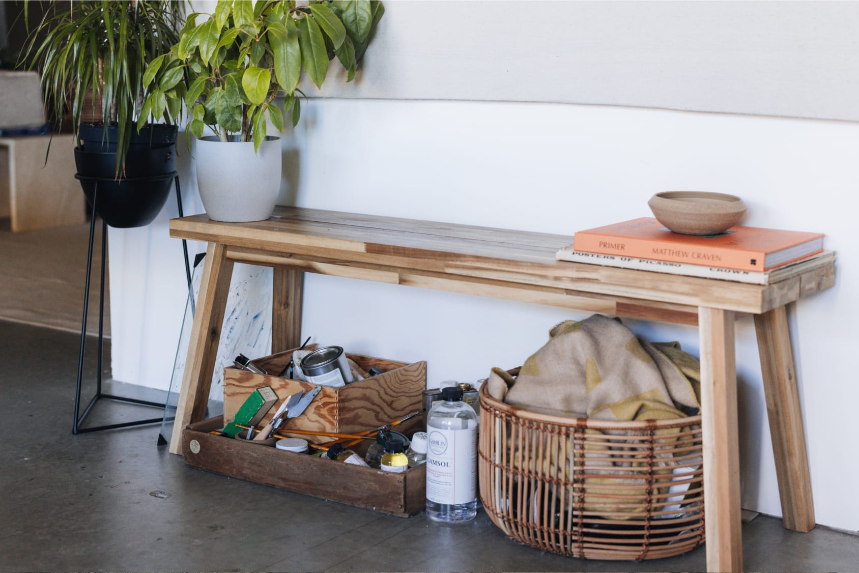
How do the politics of today find themselves in your art? (If they do at all)
The titles of my pieces usually provide some context into what I'm thinking while creating. I'm always happy to explain the ideas behind works when asked but prefer to let people draw their own conclusions. Not because I enjoy being cryptic, but because part of the beauty of art is the mirror it holds up to the viewer, letting them see pieces of themselves reflected. Occasionally I'll be more subversive and direct, including a longer caption of my thoughts, these tend to be the pieces that are more politically motivated, where I want what I'm saying to be understood clearly and not left up for interpretation.
Social media is typically used to spotlight the artist behind their work and give the public a look behind the curtains. Was it a conscious choice to remain hidden from view while letting your work do the talking? What are your thoughts on the intersection of art and social media?
I prefer the work to stand on its own, I'm an artist first and foremost not an entertainer. If I need to do a song and dance to accompany it, the work probably isn't very good in the first place. I'll occasionally show myself, it's not something I'm opposed to, but I have a distaste for people who use art to fill out their personalities and seem more interesting. Social media is saturated with process videos and personalities, the journey is fun, but the final result has to matter. Say it through the art not while standing in front of it. That said, social media has been amazing for art as a whole. More people than ever have exposure for their work. People that traditionally would have worked a 9-5 and painted on the weekend can now make a living through their art. In the moment it might feel like it's caused an avalanche of bad art, but that will get sorted out historically. There's always been bad art, it fades away and 50 years later only the good remains.
I touched on it a little before, but my art tries to reach back to the roots of humanity and pull from feelings we can all relate to regardless of country, culture, and language. The elements I use reflect that, the sun, moon, people, animals, and natural events. Basically, things from early man that are deep in all of us. Modern life is entirely saturated by sound, light, and movement, all at a break-neck pace. Its inescapable.
GRAPHIC TEES

